06 / 06
Reinventing a 100-Year-Old Brand
100%
Org-Wide Adoption
A 100-year-old brand was being interpreted differently by every team, agency, and vendor touching it.
Art Director & UX Architect — brand audit, design system, and guidelines portal.
100% org-wide adoption across internal teams and agency partners.
AMA had been serving Albertans for over a century. But its digital presence told a dozen different stories — depending on which team had last touched the page. A great brand deserves better.
As AMA expanded its digital footprint — new apps, new portals, new campaigns — the visual and verbal brand had fragmented across departments. Design decisions were being made independently by internal teams, external agencies, and vendors, each interpreting the brand differently. The result was an inconsistent member experience and a brand that felt younger and less credible than its 100-year legacy deserved.
My mandate: Build a comprehensive digital brand system that would unify AMA's visual identity across every digital touchpoint — and get every team, agency, and vendor to actually use it.
"Brand guidelines only work if people use them. So we designed them to be impossible to ignore — beautiful enough to be worth opening, clear enough to make the right choice the easy choice."
Collected every digital touchpoint — app screens, web pages, email templates, social assets, campaign materials — and mapped the inconsistencies.
Worked with brand and marketing leadership to codify the core: colour system, typography scale, logo usage, photography direction, and tone of voice.
Built a Figma design system that operationalised brand decisions into reusable, documented components — with do/don't examples for every pattern.
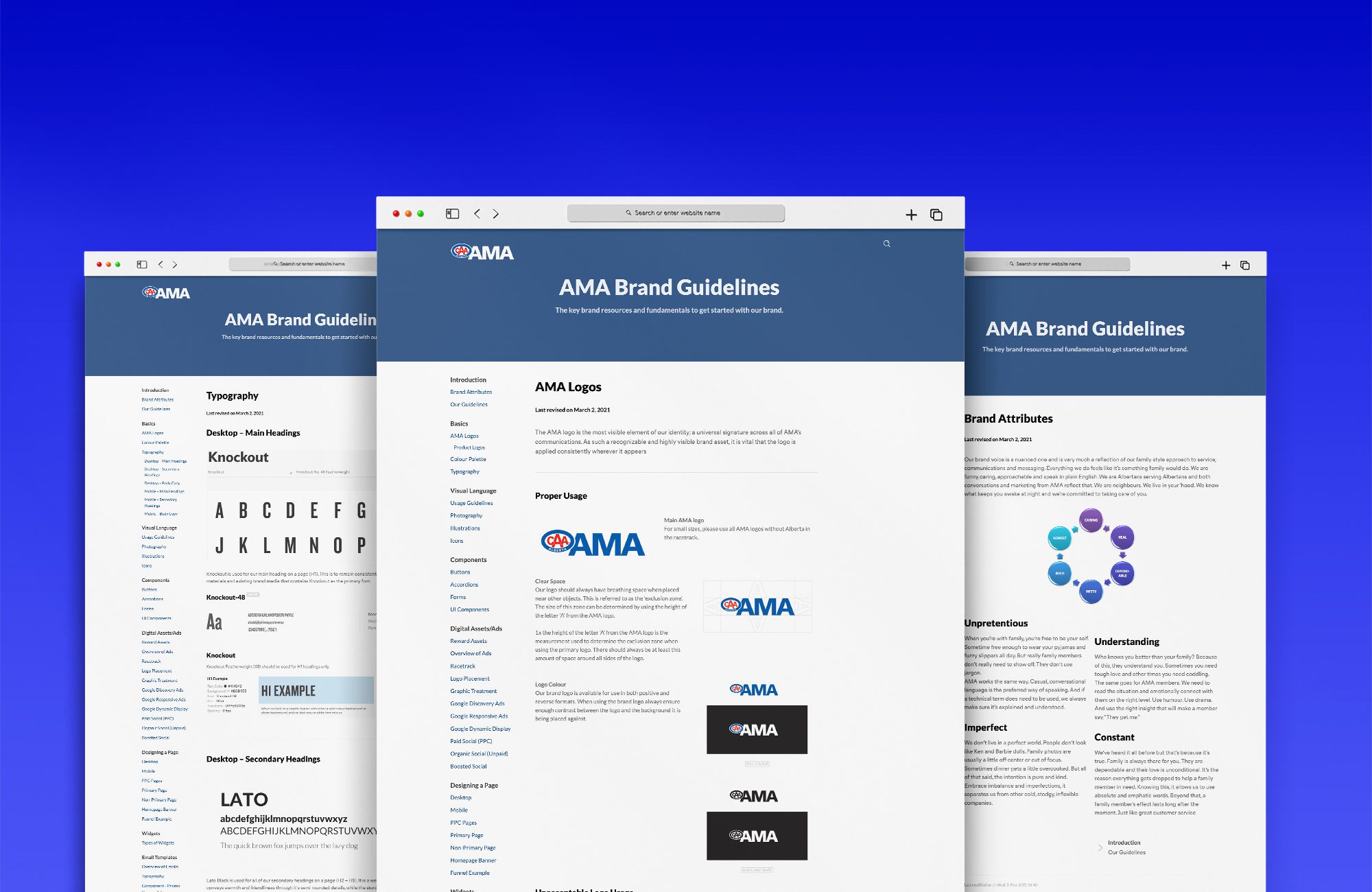
Designed and built an internal brand portal — a living website that housed all guidelines, assets, and downloads in one searchable, always-current reference.
Led workshops with every internal team and key agency partners, ensuring understanding and buy-in before the system went live org-wide.
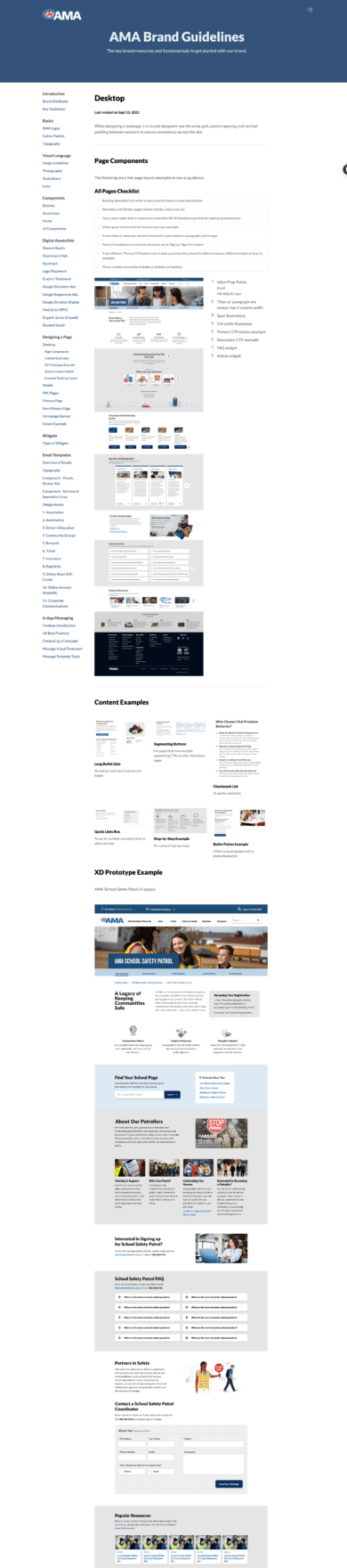
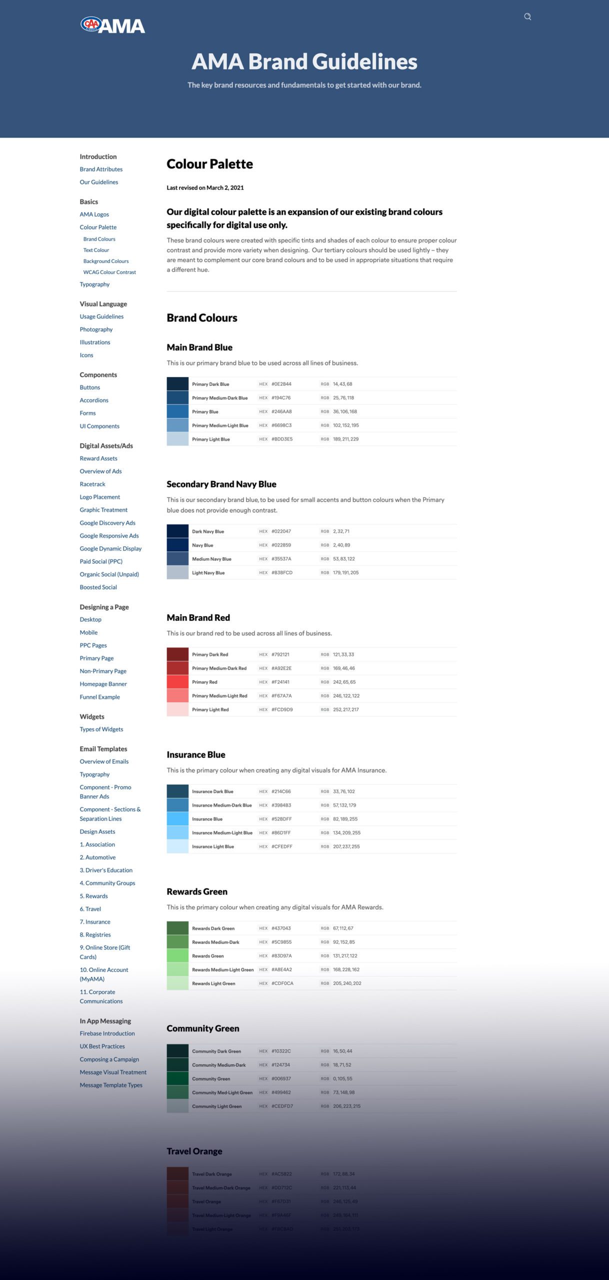
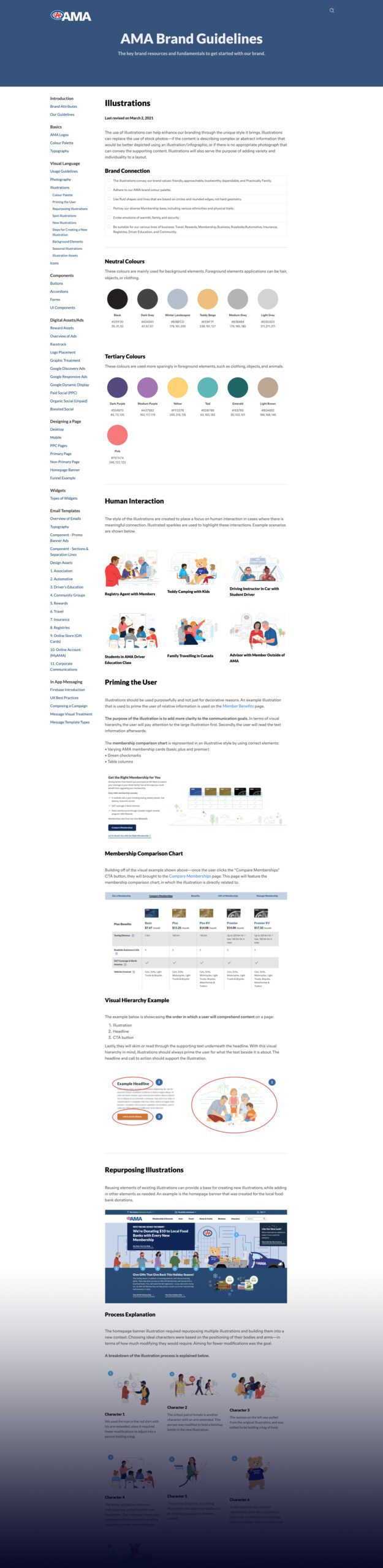
The AMA Digital Brand Guidelines launched as a comprehensive, living system — covering colour, typography, iconography, photography, motion, accessibility, component usage, and copy voice. The guidelines site made everything findable in seconds, with downloadable assets, Figma component libraries, and annotated examples for every use case.
Key design decisions: The guidelines were designed to be aspirational, not just prescriptive — showing the brand at its best, not just its minimum. A tiered structure meant casual users could find answers fast, while deeper documentation supported power users. A "common mistakes" section became one of the most-used resources, giving teams permission to self-correct without escalating to design leadership.
Add a video — paste a YouTube or Vimeo link, or upload to /videos/digital-brand-guidelines.mp4