03 / 06
Increasing Online Membership by 200%
5×
Plus Membership Sales
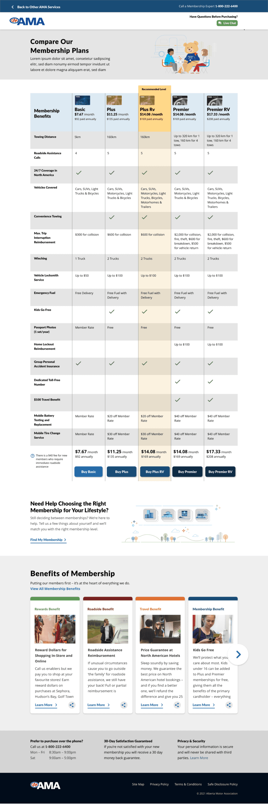
Dense tier-comparison tables caused decision paralysis — ready-to-buy visitors were abandoning or phoning in.
UX Lead — funnel strategy, needs-based recommendation design, A/B testing.
+200% online purchases and 5× sales of the highest-value Plus tier.
Potential members were arriving ready to buy — and leaving without a membership. The funnel was doing the opposite of its job.
AMA offers multiple membership tiers: Classic, Plus, and Premier — each with meaningfully different benefits. But the online purchase flow threw all three at users simultaneously with dense comparison tables and insurance-policy language. The result? Decision paralysis. Most users either called in (costly) or left entirely. The funnel was technically functional but strategically broken.
My mandate: Redesign the membership purchase funnel to surface the right membership for every user — and convert more of them online.
"Members didn't struggle to commit — they struggled to understand. The moment we made the right choice obvious, conversion followed naturally."
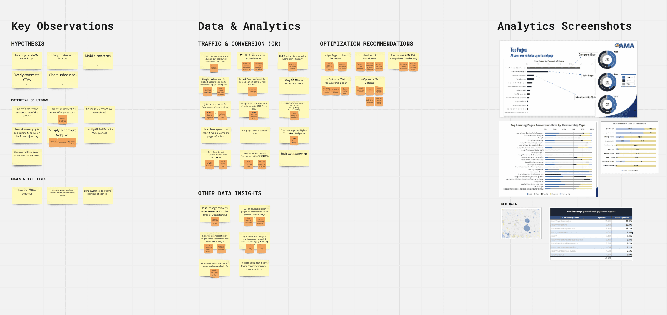
Analyzed drop-off data across every step: where users lingered, where they left, and what questions they were Googling mid-funnel.
Spoke with 18 members who had purchased online and 12 who had called in — understanding the "why" behind each behaviour.
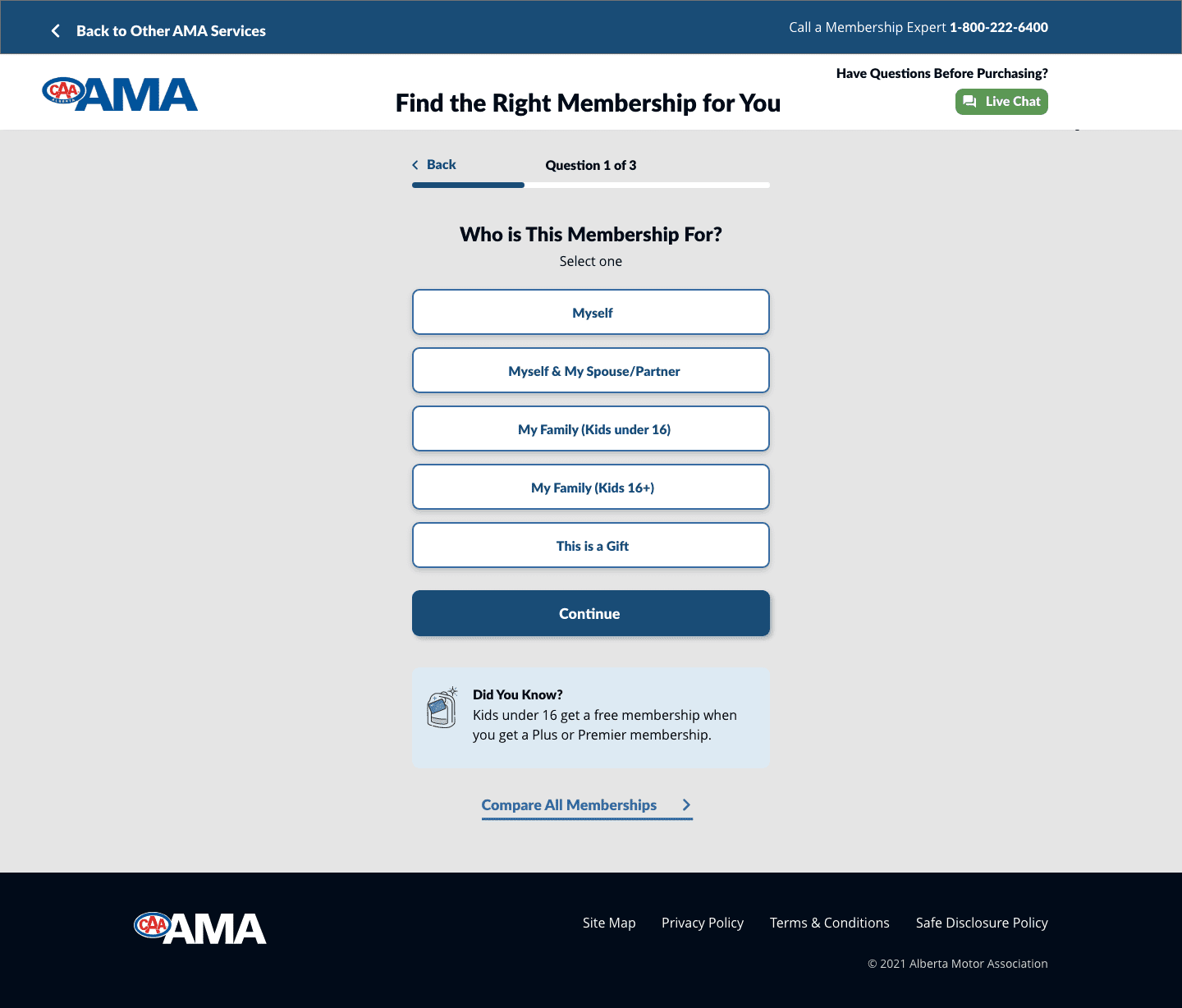
Designed a needs-based questionnaire that matched users to the right tier in 3 questions — removing the burden of self-selection.
Tested 4 funnel variants — different recommendation approaches, benefit framing, and CTA treatments — with live traffic before full launch.
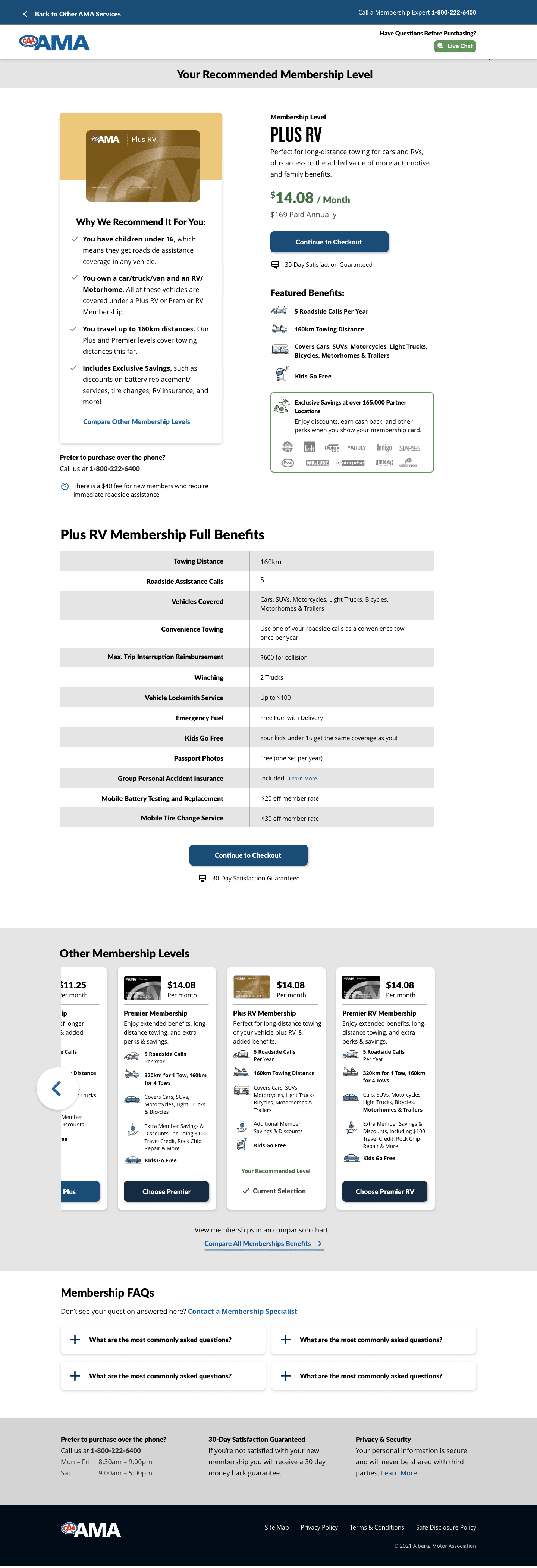
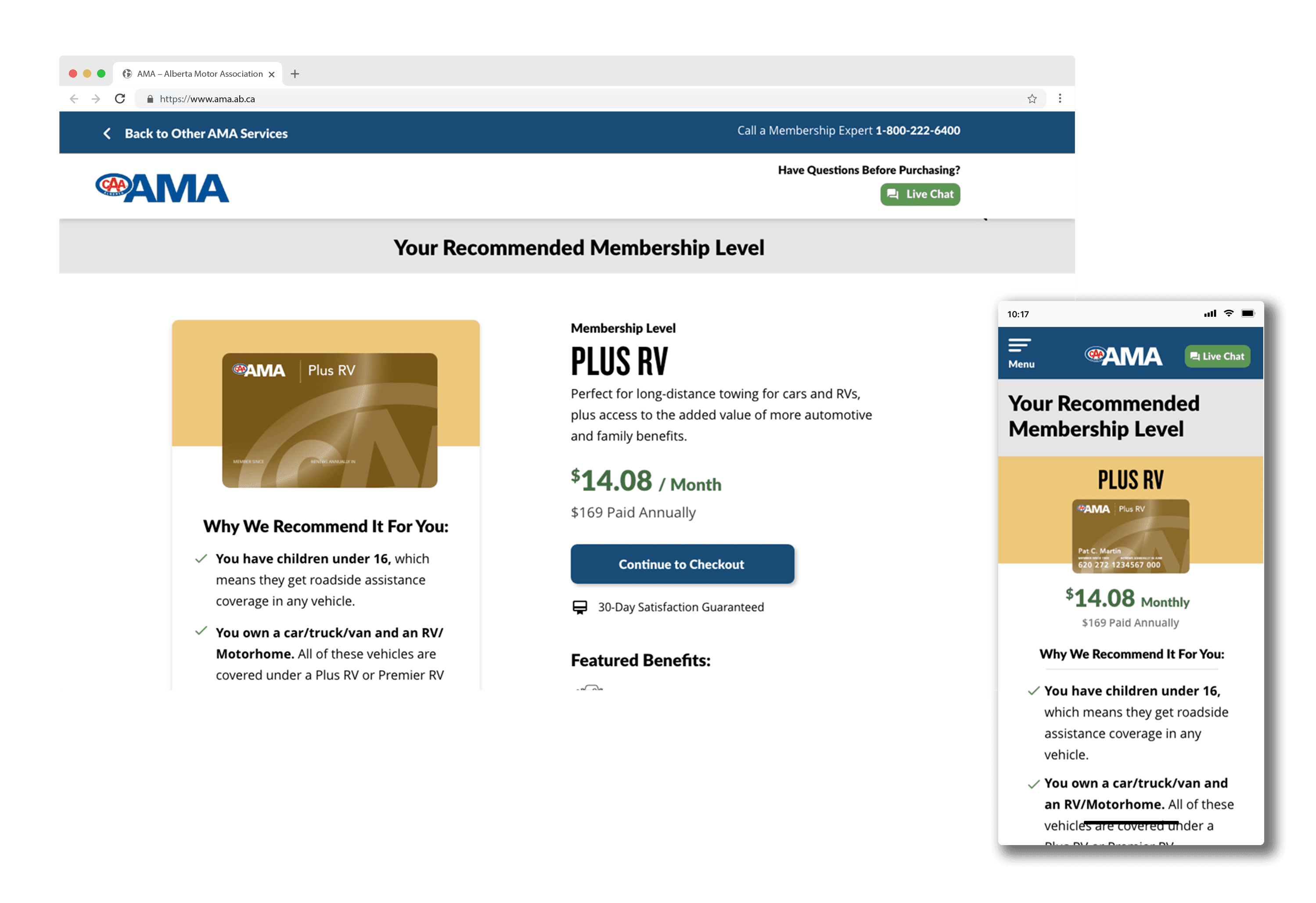
The redesigned funnel opened with a short, conversational questionnaire: "What brings you to AMA today?" Based on responses — roadside, travel, family, all of the above — the system recommended a specific membership tier with a clear, benefit-focused summary tailored to that user's needs.
Key decisions: We replaced the comparison table with a dynamic recommendation card. Benefit language was rewritten from policy-speak to plain English. The checkout itself was reduced from 7 steps to 4, with progress clearly visualised. Trust signals — member count, Google rating, BBB accreditation — were placed at every hesitation point.