Role
Lead UX/UI Designer
UX Strategist
IA Architect
QA/UAT Stakeholder

Lead UX/UI Designer
UX Strategist
IA Architect
QA/UAT Stakeholder
XD (Switched to Figma)
4 weeks
We aimed to enhance the online membership purchase process by addressing issues related to member understanding of value and selection. The existing funnel, on an outdated platform, required better integration and needed to seamlessly align with multiple entry points. The final solution optimized user experience, offering multiple options for users to easily identify and choose the right membership.


We gathered user insights from our member journey team, who performs ongoing surveys and focus groups of prospective customers to find pain points and feedback on the existing funnel. Additionally, we conducted interviews with our Customer Support Team to ascertain the specific complaints received regarding the online membership sign-up process.


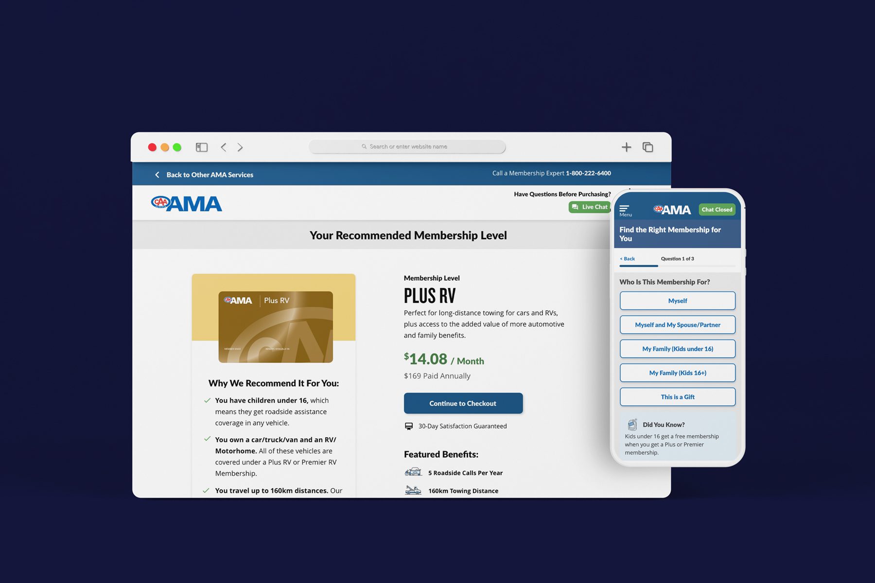
To assist prospective members with selecting the membership that is right for them, we took two approaches: an interactive lifestyle-based questionnaire from the top-level marketing page, or three quick questions if the user jumped straight into the checkout funnel.
This led to a higher number of recommended Plus Memberships, subsequently driving a fivefold surge in Plus Membership purchases.
Once users are given a recommended Membership level, I designed a one-page checkout funnel to decrease friction and optimize speed. By utilizing accordions for steps, all fields are hidden, forming a sort of menu. When a prospect lands at the checkout, they either see only titles with the first step already opened. I removed all unnecessary form fields from the original form, tucked promo code into the side bar, and allowed users to easily bypass the highest friction step – adding a family member.